
Finding where you make and lose money: the breakdown reports
ℹ️ Note
The Journal reports are included with the Essential and Premium plans. See the pricing page to compare.
The Stats report tells you how your trading did overall. The breakdown reports tell you where that result came from: they take the same closed trades and slice them by one dimension at a time, so you can see which markets, directions, and times of day carried your wins and losses. This guide shows how to read them and turn a pattern into a question about your own trading.
Open the Reports tab and pick a breakdown from the row of sub-reports (Symbols, Side, Sessions, Time, Duration, Tags, and more). As always, the period, currency and account filters at the top shape every number, and only positions you have marked reviewed are counted, so a breakdown that looks emptier than your trading was usually has unreviewed trades behind it. These are historical results, not a prediction.
The shape they all share
 🔍 Click the image to see a larger version
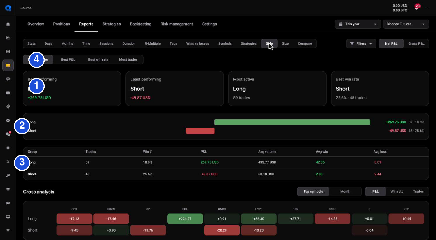
Most breakdowns follow the same layout, so once you can read one you can read them all. The numbered markers on the screenshot match this list:
- Callout cards: Best performing, Least performing, Most active, and Best win rate for that dimension.
- Ranked bar chart: each group as a bar, green to the right for profit, red to the left for loss, longest bars first.
- Table: Trades, Win %, P&L, Avg volume, Avg win and Avg loss per group.
- Sort toggles (Best P&L, Best win rate, Most trades) to reorder by what you care about.
So a quick read is: which bars are green, which are red, and is the red coming from many small losses or a few large ones (the Avg loss and Trades columns tell you which).
By market (Symbols)
 🔍 Click the image to see a larger version
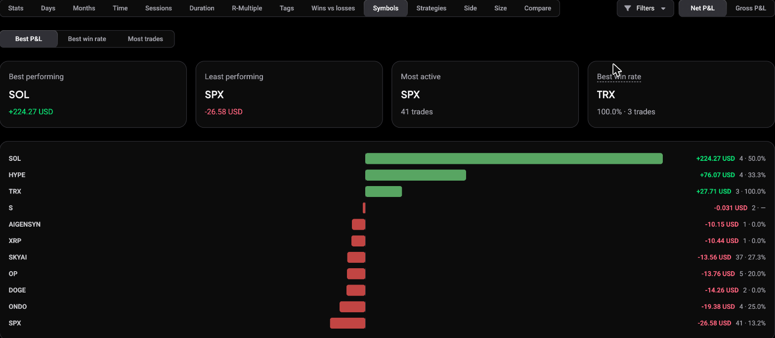
The Symbols report ranks every market you traded. It is the fastest way to see whether your result is broad or concentrated: often a single market is responsible for most of the damage, or most of the gain, and the bar chart makes that obvious at a glance.
By direction (Side)
 🔍 Click the image to see a larger version
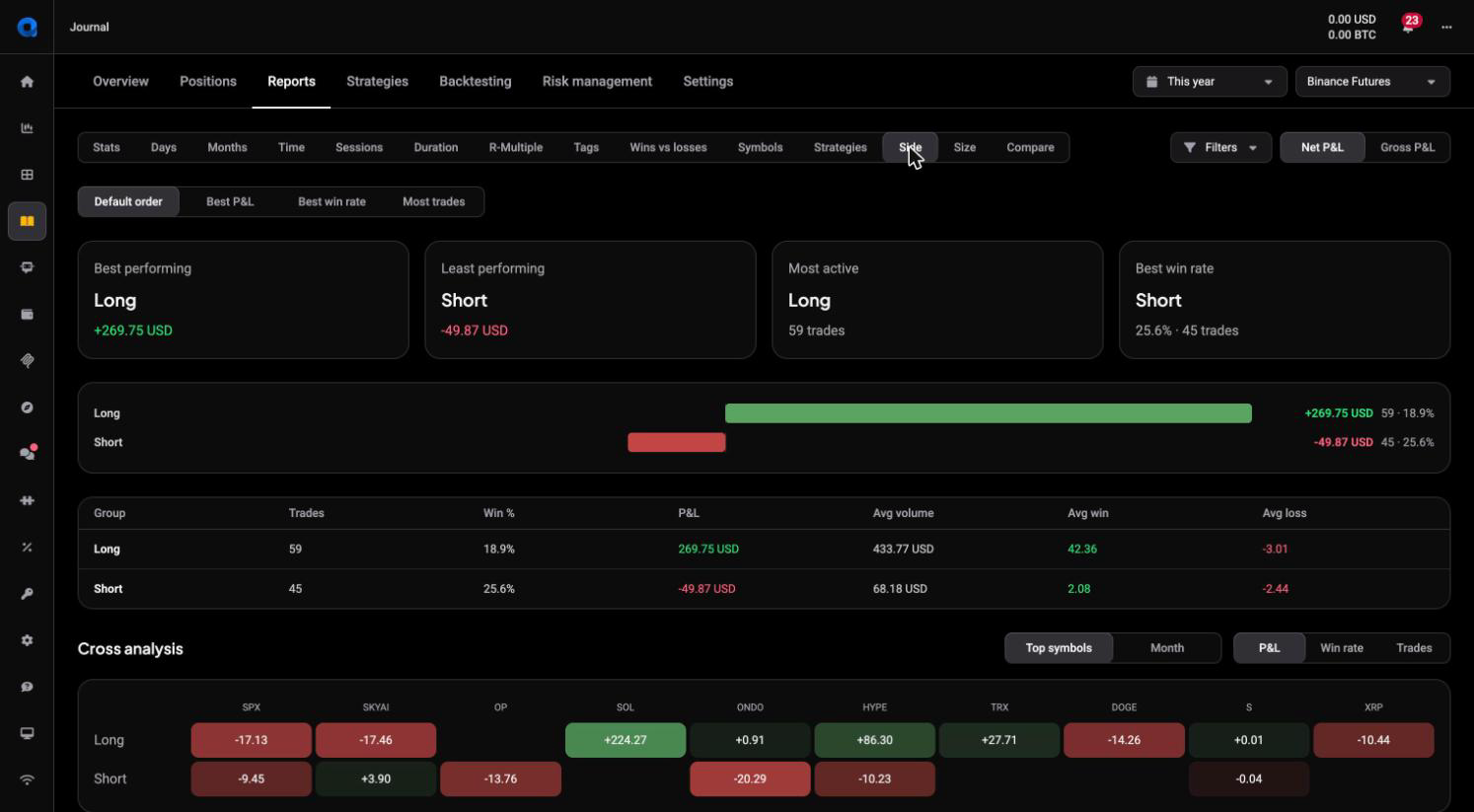
The Side report splits long versus short. Underneath the usual table it adds a Cross analysis heatmap: long and short down the side, your top symbols (or months) across the top, each cell coloured by P&L, win rate or trades. That is where a lopsided habit shows up, for example longs working while shorts bleed on the same markets.
By time (Time, Sessions, Duration)
 🔍 Click the image to see a larger version
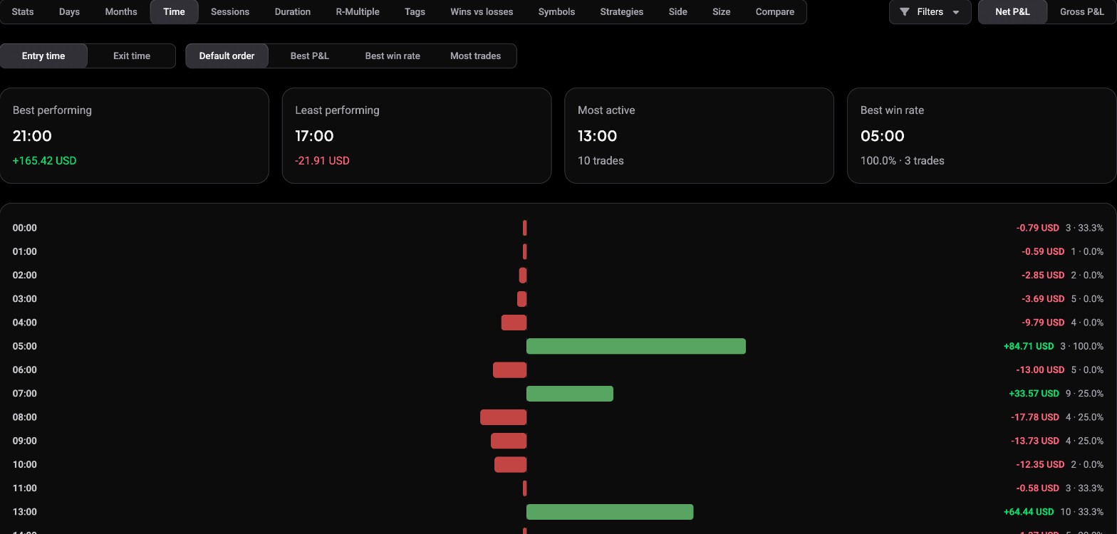
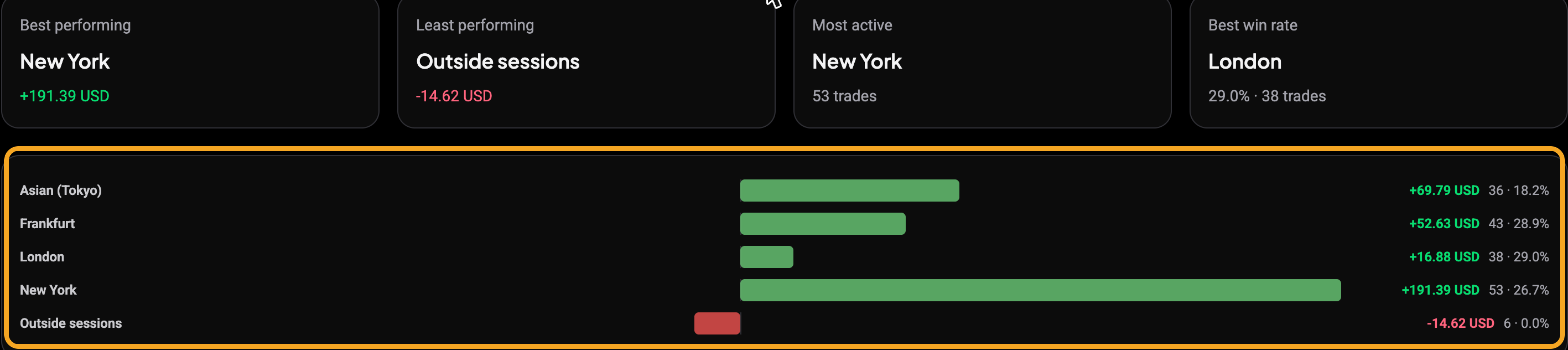
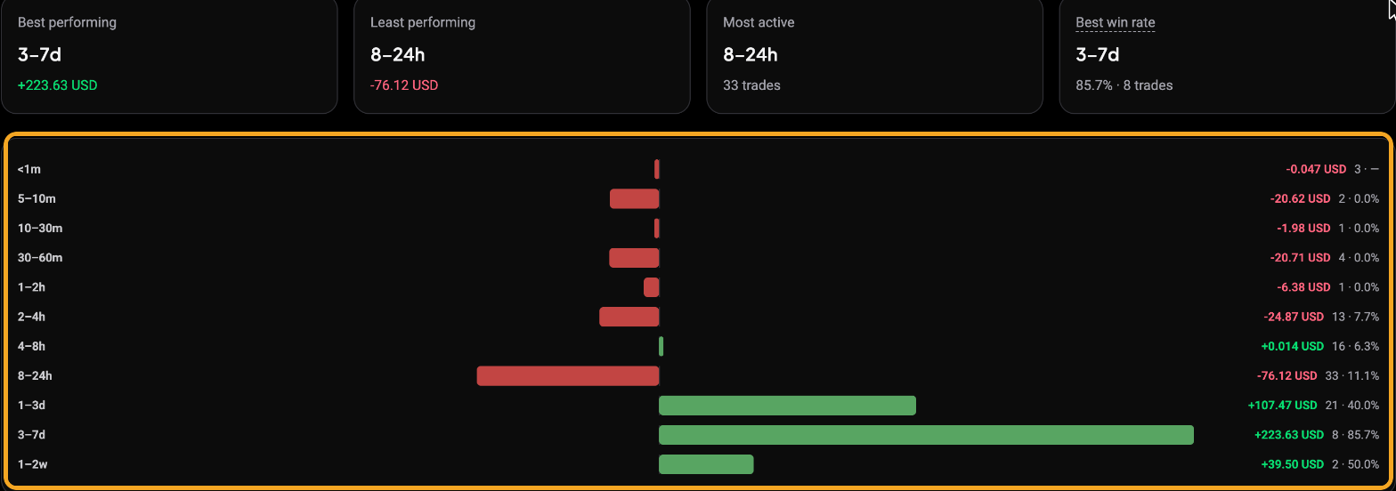
Time breaks results down by hour, with an Entry time / Exit time toggle, so you can see which hours of the day your trades actually made or lost money. Sessions groups the same idea into trading sessions, and Duration groups by how long trades were held. Together they answer whether time-of-day or holding length lines up with your results.
The Sessions view regroups the same trades by market session, from Asian and Frankfurt through London and New York, plus an Outside sessions bucket for anything in between:
 🔍 Click the image to see a larger version
The Duration view regroups them by how long each trade stayed open, from under a minute up to one to two weeks, so you can see whether your quick trades or your held ones carry the result:
 🔍 Click the image to see a larger version
By tag
If you tag your reviews (FOMO, Moved stop, Counter trend, and so on), the Tags report plots each tag on a quadrant chart rather than a bar list. Win rate runs left to right, total P&L runs bottom to top, and each tag is a bubble sized by how many trades carry it.
 🔍 Click the image to see a larger version
The numbered markers are: 1 the Keep doing quadrant (top right: tags that win often and make money), 2 the Stop doing quadrant (bottom left: tags that lose, and lose often), 3 the win-rate axis along the bottom, and 4 the P&L axis up the side. A tag sitting far into one quadrant is the honest label you added during review turned into a number instead of a feeling. See how to review, rate and tag your trades.
R-Multiple, and why it may say “No R data”
 🔍 Click the image to see a larger version
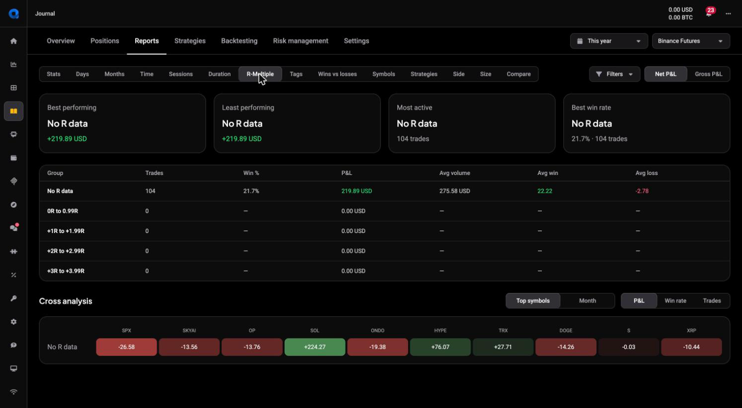
The R-Multiple report groups trades by how many multiples of the risked amount each returned (0R to 0.99R, +1R to +1.99R, and so on). It only works for smart positions opened in Altrady, because R needs a stored stop loss. Trades synced or imported from an exchange land in a single No R data row, which is expected: import does not carry a stop, so there is nothing to measure R from.
By outcome (Wins vs losses)
 🔍 Click the image to see a larger version
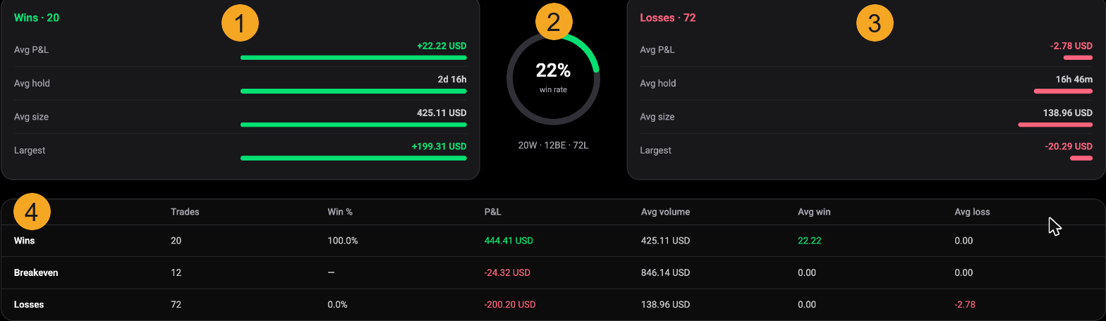
The Wins vs losses report takes the same closed trades and splits them three ways: winners, breakeven trades and losers. The markers above are 1 the Wins card (average P&L, hold time, size and largest win), 2 the win rate dial with the win / breakeven / loss count beneath it, 3 the Losses card carrying the same measures for losing trades, and 4 a summary table lining up Trades, Win %, P&L, Avg volume, Avg win and Avg loss per group. It answers one thing cleanly: are your average winner and average loser really the size you assumed?
By strategy (Strategies)
 🔍 Click the image to see a larger version
If you assign a strategy to your trades, the Strategies report ranks each one the same way the other breakdowns do: callout cards on top, then a bar per strategy (highlighted above), a table and a cross-analysis grid. Trades with no strategy set fall into a single No strategy row, so a large No strategy bar usually just means most trades were never given one.
By position size (Size)
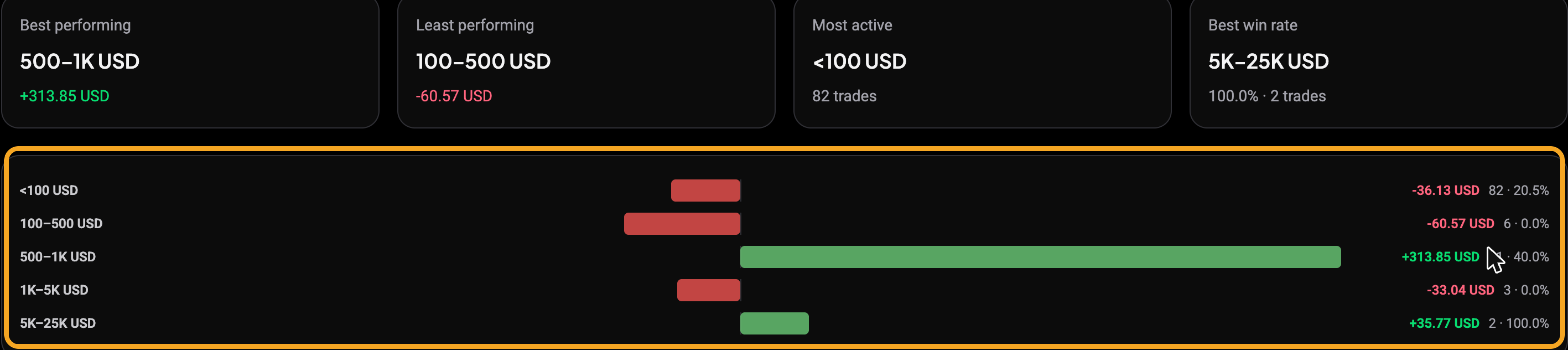 🔍 Click the image to see a larger version
The Size report groups trades into position-size bands (under 100 USD, 100 to 500, 500 to 1K, and up), with the ranked bars highlighted above. It shows whether your bigger positions are pulling their weight, or whether size and result are moving in opposite directions.
Turning a pattern into a question
A breakdown does not tell you what to trade; it points you at the part of your own record to look at next. One market holding all your red, one session that never works for you, a tag that keeps appearing on losers: each is a prompt to open those specific trades and see what you actually did. To check whether a change you make afterwards shows up in the numbers, use comparing periods and tracking progress.
Still stuck?
If a breakdown looks empty or wrong, check your filters and confirm the trades are reviewed, since unreviewed positions are left out of every report. Then reach out through support chat in the app and the team can take a look.