
Comparing periods and tracking your progress
ℹ️ Note
The Journal reports are included with the Essential and Premium plans. See the pricing page to compare.
Reading a single report tells you how one slice of trading went. To know whether you are actually improving, you need to put two slices next to each other: this month against last, long trades against short, or the trades with a habit tagged against the ones without. The Reports tab has two tools for that: the period filters and the Compare view.
All of these numbers are historical, and all of them are built from closed positions you have marked reviewed. Comparing them shows what changed in your record, not what will happen next.
Shift the period
The period selector at the top right carries every report. Its presets (Last 7 days, Last 30 days, Last 3 months, This year, Last year) and the custom range let you move the same report through time. Flip a report between two periods and watch which numbers move: that is the simplest before-and-after there is.
The Months report and the day-by-day views make the trend visible without switching periods by hand, and the Net P&L / Gross P&L toggle lets you check how much of a change was really fees.
Weekday and month patterns
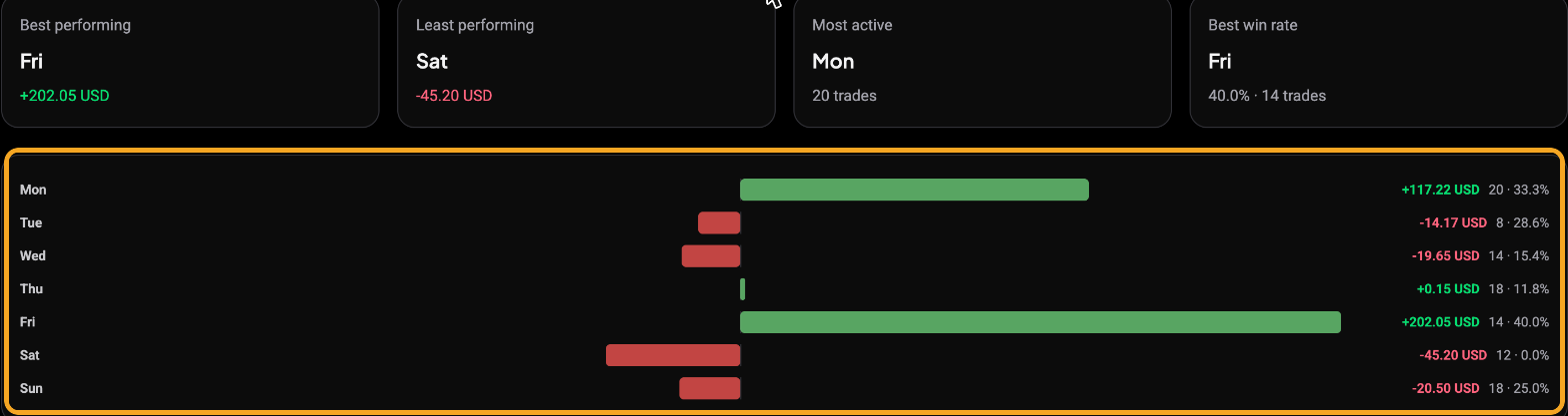
Two reports group your trades by calendar position instead of by market. The Days report buckets every trade by day of the week, Monday through Sunday, with the ranked bars highlighted here:
 🔍 Click the image to see a larger version
The Months report does the same by calendar month, which is the quickest way to see your trend across the year without changing the period by hand:
 🔍 Click the image to see a larger version
Both carry the Entry time / Exit time toggle, so you can group by when a trade was opened or when it was closed.
Compare two groups side by side
 🔍 Click the image to see a larger version
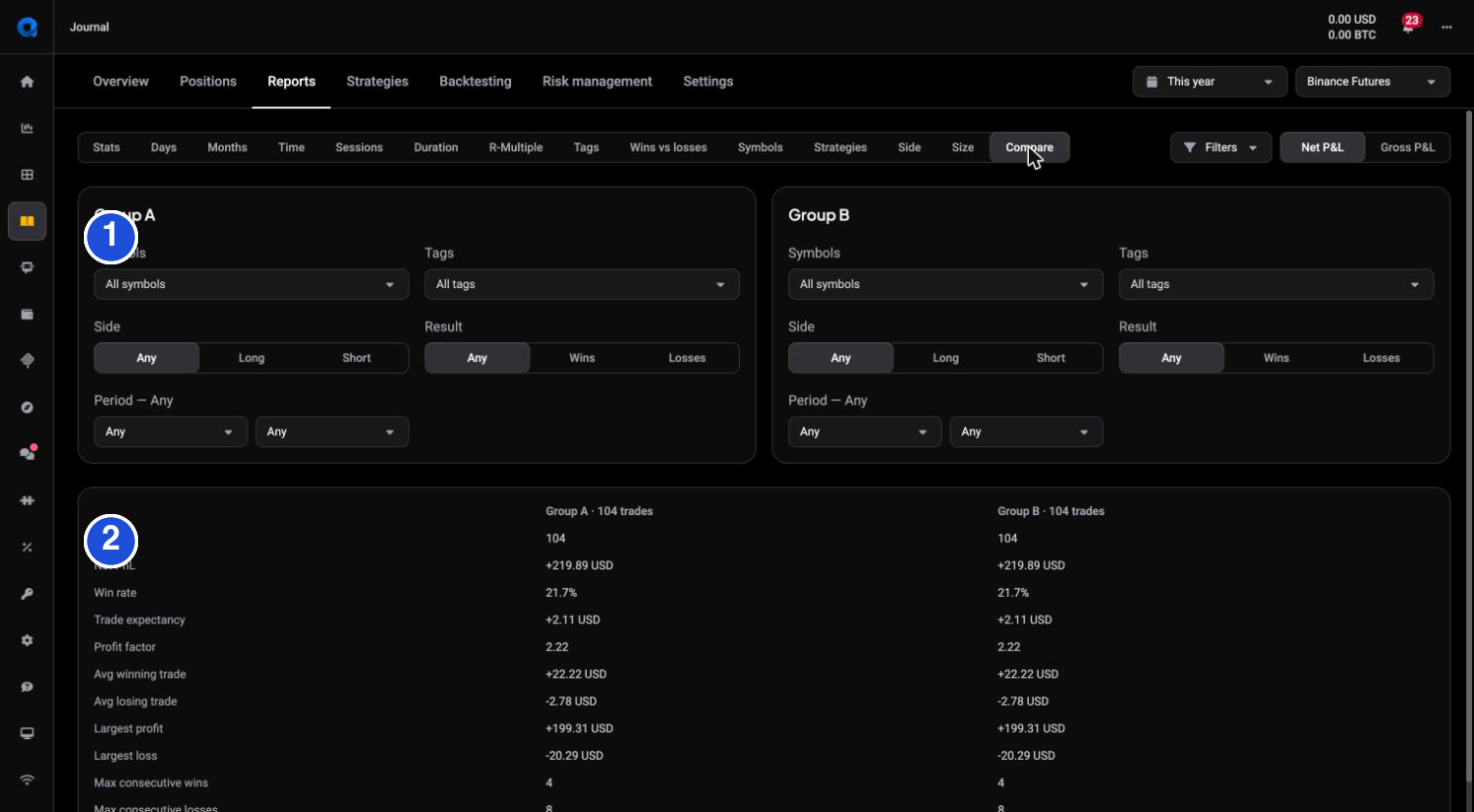
On the screenshot: 1 build each group from its own filters, and 2 read the two groups side by side in the table below.
The Compare report puts Group A and Group B next to each other, and you define each group with its own filters: Symbols, Tags, Side (Any / Long / Short), Result (Any / Wins / Losses) and Period. Below the two panels, a single table lines up the same stats for both: Trades, Net PnL, Win rate, Trade expectancy, Profit factor, Avg winning and losing trade, Largest profit and loss, and the streak figures.
Because each group is fully filtered, Compare answers questions a single report cannot:
- This month vs last month: same everything, only the Period differs.
- Long vs short: Group A Side = Long, Group B Side = Short, to see which direction actually pays.
- A habit vs without it: Group A Tag = FOMO, Group B all trades, to put a real cost on the habit.
- One market vs the rest: Group A a single symbol, Group B the others.
Read the difference honestly
The trap with any comparison is a small sample. A handful of trades can swing a win rate or a profit factor a long way on luck alone, so a difference across ten trades is a hint, not a verdict; the same difference across a few hundred means much more. Check the Trades count on both groups before you trust the gap between them, and lean on the comparisons where both sides have enough trades to be worth reading.
If a group holds far fewer trades than you expected, the usual cause is unreviewed positions rather than the filters. See how do I review, rate and tag my trades.
Used this way, Compare closes the loop: you spot something in the breakdown reports, change how you trade, then come back and compare the period before your change with the period after to see whether it actually shows up.
Still stuck?
If a comparison looks off, or a group returns no trades you expected, check each group’s filters and confirm the trades are reviewed, then reach out through support chat in the app and the team can look with you.